Web Design · May 21, 2026 · 7 min read
5 polished websites that lose customers — and the simple fixes
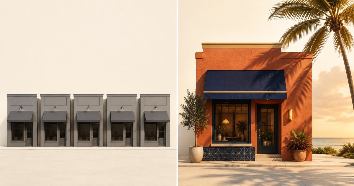
Beautiful design doesn't equal revenue. Here are five real patterns we see in Sarasota and Bradenton small-business websites that look professional but hemorrhage leads — and what to fix first.

Pretty is not the same as effective
Every month we audit websites for Suncoast businesses that look polished — clean design, professional photos, modern fonts — but convert at half the rate they should.
The owner spent $3,000 on design. The site won a local chamber award. Customers say "nice website" when they call. But the calls are fewer than expected, and the contact form sits empty.
The problem isn't aesthetics. It's that the site was designed to look good instead of work hard. Nobody optimized for the boring stuff: where the phone number goes, how long the form is, whether the value proposition makes sense to someone who landed here from Google.
Here are five patterns we see constantly. No real business names, but if you recognize your site in here, you're not alone.
Site #1: The mystery form
What it looks like: Gorgeous hero image. Tasteful typography. Scroll down two screens and there's a contact form asking for:
- First name
- Last name
- Phone
- Service needed (dropdown with 8 options)
- Preferred contact method
- Best time to reach you
- Tell us about your project (text box)
- How did you hear about us?
That's nine fields. The owner thinks this helps them qualify leads. What it actually does is kill 60–70% of conversions before they start.
Why it loses customers: Every additional form field costs you 5–10% of submissions. People filling out forms on mobile — which is 70% of traffic — are doing it one-handed while standing in line at Publix. They want to tap "submit" and get back to their day.
The business owner never sees the 8 people who started the form and gave up. They only see the 2 who finished it and think "great, quality leads."
The fix: Cut it to three fields: name, phone, email. That's it. If you need to qualify leads, do it on the phone call. Your form's only job is to start the conversation. Put it above the fold on every service page.
Site #2: The hidden phone number
What it looks like: Minimal header with just the logo and a "Menu" hamburger icon. Click the menu, scroll down, there's a "Contact" link. Click that, now you're on a contact page with the phone number in 12pt gray text at the bottom.
Meanwhile, a potential customer just searched "emergency plumber Bradenton" at 9pm because their kitchen is flooding. They need a phone number right now.
Why it loses customers: 40% of local searches have immediate commercial intent. The searcher wants to call someone in the next 5 minutes. If your number isn't visible and tappable in the header on mobile, they're calling your competitor.
This happens because the designer prioritized "clean" over "functional." The phone number felt cluttered in the header mockup. So it got buried.
The fix: Put your phone number in the top-right corner of every page, desktop and mobile. Make it click-to-call on mobile (use <a href="tel:+19415551234"> in the HTML). Optionally add a floating "Call Now" button that stays visible as users scroll. Yes, it's less minimalist. It also brings in 20–30% more calls.
Site #3: The vague hero copy
What it looks like: Beautiful full-screen photo of a Venice sunset or a modern office. Headline in elegant serif font:
"Excellence in Every Detail"
"Your Trusted Partner Since 2012"
"Quality You Can Count On"
Subheadline (if there is one): "Serving the Greater Sarasota Area with Pride"
That's the entire above-the-fold message. No mention of what the business actually does.
Why it loses customers: When someone lands on your site from a "[service] near me" search, they're asking one question: can this business solve my problem today?
Generic trust language doesn't answer that. It sounds like every other small business. The visitor has six tabs open. They close yours in 4 seconds and move on.
The fix: Lead with the specific problem you solve, not your brand values. Examples:
- "Emergency AC Repair in Sarasota — 2-Hour Response Time"
- "Lakewood Ranch Kitchen Remodeling — Fixed-Price Quotes in 48 Hours"
- "Commercial Pest Control for Bradenton Restaurants — Monthly Plans from $180"
Boring? Maybe. But it tells the visitor immediately whether they're in the right place. You can talk about your 12 years of excellence in paragraph two.
Site #4: The proof-free promise
What it looks like: Clean layout. Service descriptions are thorough. The "About Us" page talks about the team's combined 40 years of experience. There's a mission statement. Maybe a photo of the owner shaking someone's hand.
What's missing: reviews, certifications, project photos, anything a skeptical buyer could verify.
Why it loses customers: People don't trust websites anymore. They trust other people's experience with the business. If you say "we're the best roofer in Sarasota," that's marketing. If 60 Google reviews say it, that's evidence.
A site without visible proof reads like a site that has something to hide — even when the business is perfectly legitimate.
The fix: Add three trust signals above the fold:
- Google review widget showing your star rating and recent reviews (or at minimum, a badge linking to your Google Business Profile)
- Specific credential — "Licensed & Insured," "Certified by [relevant org]," "A+ BBB Rating" (only if true)
- Recent project photo with a real caption: "Pool screen enclosure we installed in Palmer Ranch, January 2024"
Don't have reviews yet? Stop reading this and text your last 10 customers a Google review link right now. That's more important than anything else on this list.
Site #5: The one-page-fits-all site
What it looks like: Homepage lists "Sarasota | Bradenton | Venice | Lakewood Ranch | North Port" in the footer. Mentions them once or twice in the body copy. One generic "Services" page covering everything the business does.
No dedicated page for each city. No dedicated page for each major service.
Why it loses customers: Google ranks pages, not websites. When someone searches "bathroom remodel Bradenton," Google looks for a page that's specifically about bathroom remodeling in Bradenton.
A homepage that mentions Bradenton in passing will lose to a competitor with a dedicated "/bathroom-remodeling-bradenton" page, even if that competitor is newer or smaller.
This is the single biggest local SEO mistake Suncoast businesses make. They assume Google will connect the dots. It won't.
The fix: Build individual pages for:
- Each service you offer ("Kitchen Remodeling," "Bathroom Remodeling," "Whole-Home Renovations" — separate pages)
- Each city/area you serve (Sarasota, Bradenton, Venice, Lakewood Ranch — separate pages)
- Ideally, each service × city combination for your top services ("Kitchen Remodeling in Sarasota," "Kitchen Remodeling in Bradenton," etc.)
Each page needs 400–600 words of genuinely different content. Not find-and-replace. Include specifics about that area, mention landmarks, talk about why customers there hire you. Google knows the difference between real content and templated spam.
What these five have in common
Every one of these sites was built by someone who cared about design but didn't think like a customer.
The designer made it beautiful. The owner approved the mockups. Nobody asked:
- "Will someone on a phone find the phone number in under 3 seconds?"
- "Does the headline answer 'what do you do' before the visitor scrolls?"
- "If I'm comparing three contractors, what on this page makes me pick this one?"
Those questions matter more than the font choice. A site that answers them — even if it's visually plain — will convert 2–3× better than a gorgeous site that doesn't.
What to check on your site right now
Open your homepage on your phone (not desktop). Time how long it takes to:
- Find your phone number and tap it to call
- Understand what you do and whether you serve their area
- Find proof you're good at it (reviews, photos, credentials)
- Fill out your contact form
If any of those takes more than 10 seconds, you're losing customers.
Want the full picture? We offer a free 27-point audit that checks all of this plus the technical stuff (page speed, local SEO setup, mobile usability). No pitch, no obligation — just a prioritized list of what to fix first.
And if you'd rather just talk through whether your site is costing you leads, book a 15-minute call. We'll screen-share and walk through it together.
Keep reading

How long should building your small-business website actually take?
"We'll have you live in 48 hours" usually means a template with your logo slapped on. A real custom site takes 4–8 weeks. Here's why that timeline isn't a bug — it's the entire point.

Why your website is the most expensive part of your marketing — even when you got it free
A free or cheap website costs you in lost conversions and rankings every month forever. Here's the math nobody talks about.
Custom website vs. Wix: Which is right for your Sarasota small business?
You can launch a website in a weekend on Wix or Squarespace. So why would a Sarasota small business pay for a custom-built site? An honest look at when DIY makes sense — and when it costs you customers.